Lens Widgets & Embeds
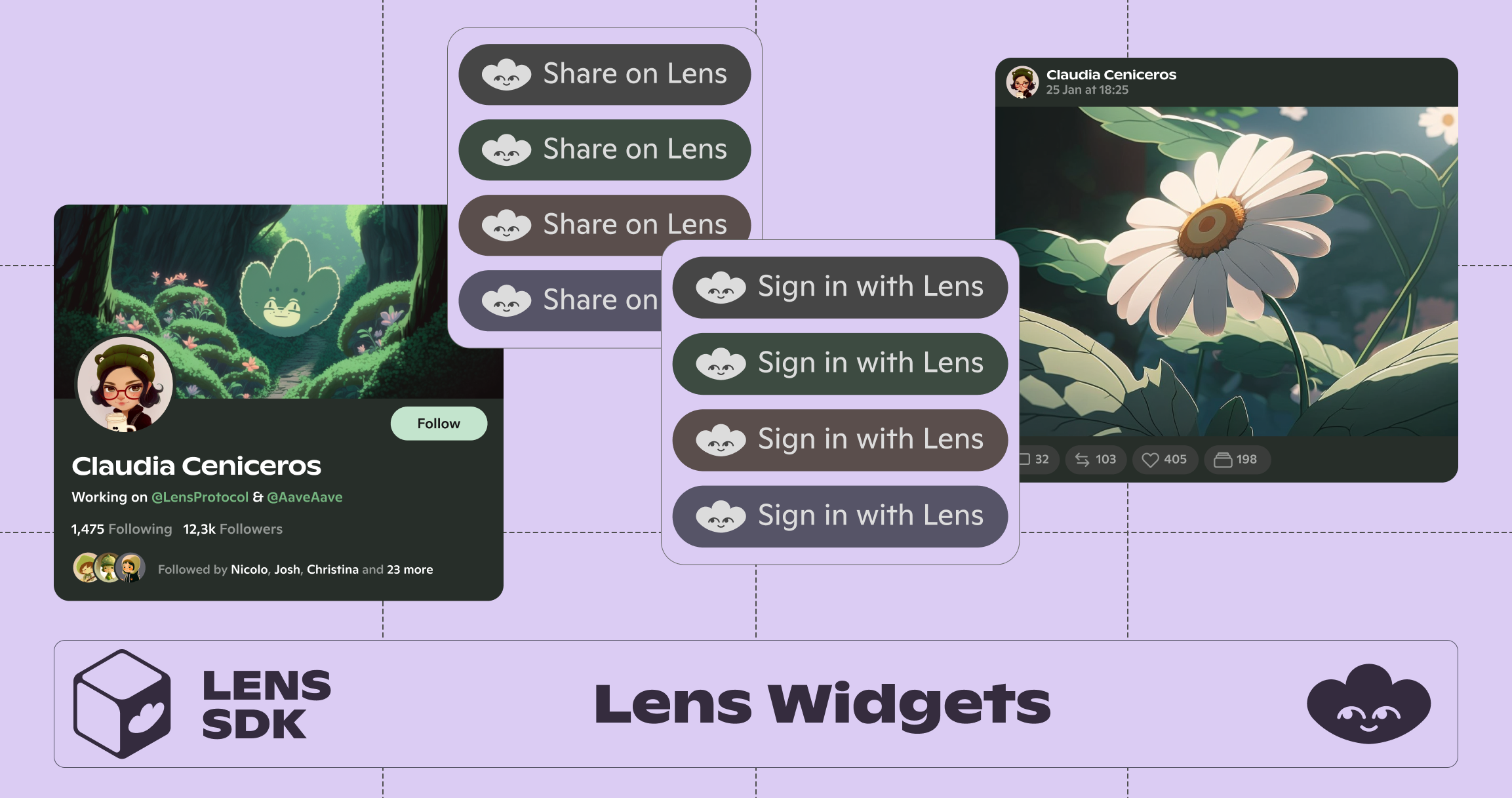
Lens Widgets enable developers to easily integrate social features into their web applications with just a few lines of code.
Lens Widgets React
To view the library on GitHub click here.
- Share to Lens
- Follow on Lens
- Sign in With Lens
- Profile Embed
- Publication Embed
- Publications / Feed
- ProfileListItem
Installation
npm install @lens-protocol/widgets-react
Share to Lens
import {
  ShareToLens, Theme, Size
} from '@lens-protocol/widgets-react'

<ShareToLens
  content="Hello World!"
/>

/* Optional parameters */
url: string = "https://your-awesome-app.com"
hashtags: string = "web3,social,blockchain"
via: string =  "YourAwesomeApp"
title: string = "Share your post on Lens 🌿"
theme: Theme (default, dark, light, mint, green, peach, lavender, blonde)
size: Size (small, medium, large)
Follow on Lens
import {
  FollowOnLens, Theme, Size
} from '@lens-protocol/widgets-react'

<FollowOnLens
  handle="stani"
/>

/* Optional parameters */
theme: Theme (default, dark, light, mint, green, peach, lavender, blonde)
size: Size (small, medium, large)
title: string = "Follow me on Lens"
Sign in with Lens
import {
  SignInWithLens, Theme, Size
} from '@lens-protocol/widgets-react'

async function onSignIn(tokens, profile) {
  console.log('tokens: ', tokens)
  console.log('profile: ', profile)
}

<SignInWithLens
  onSignIn={onSignIn}
/>

/* Optional parameters */
provider: Provider
title: string
theme: Theme (default, dark, light, mint, green, peach, lavender, blonde)
size: Size (small, medium, large)
Profile Embed
import {
  Profile, Theme
} from '@lens-protocol/widgets-react'

<Profile
  handle="stani"
/>

/* Optional parameters */
handle: string
ethereumAddress: string
profileId: string
theme: Theme (default, dark)
onClick: () => void
containerStyle: css style
Publication Embed
import {
  Publication, Theme
} from '@lens-protocol/widgets-react'

<Publication
  publicationId="0x9afd-0x02e8"
  theme={Theme.dark}
/>

/* Optional parameters */
theme: Theme (default, dark)
Publications / Feed
import {
  Publications, Theme
} from '@lens-protocol/widgets-react'

<Publications
  handle="nader"
  theme={Theme.dark}
/>

/* Optional parameters */
profileId: string
handle: string
theme: Theme (default, dark)
ProfileListItem
import {
  ProfileListItem
} from '@lens-protocol/widgets-react'

<ProfileListItem
  handle="christina"
/>

/* Optional parameters */
profileId: string
handle: string
profile: Profile
theme: Theme (default, dark)
onClick: () => void
onFollowPress: () => void
isFollowing: boolean
containerStyle: {}
followButtonContainerStyle: {}
followButtonStyle: {}
With Next.js
If you are using Next.js pages directory please update your next.config.js with the following:
transpilePackages: ['@lens-protocol'],
So the final configuration might look like this:
/** @type {import('next').NextConfig} */
const nextConfig = {
  reactStrictMode: true,
  swcMinify: true,
  transpilePackages: ['@lens-protocol']
}
module.exports = nextConfig
Once this update is made, please re-run the server:
npm run dev
Another option when working with Next.js pages directory apps is using a Dynamic Import:
/* Profile created in separate component */
import {
  Profile
} from '@lens-protocol/widgets-react'

export default function ProfileComponent() {
  return (
    <Profile handle='christina' />
  )
}

/* ProfileComponent imported using a dynamic import */
import dynamic from 'next/dynamic'
const ProfileComponent = dynamic(() => import('../components/ProfileComponent'), { ssr: false })

export default () => {
  return (
    <div>
      <ProfileComponent />
    </div>
  )
}
Updated 9 months ago